MEMO (2015)
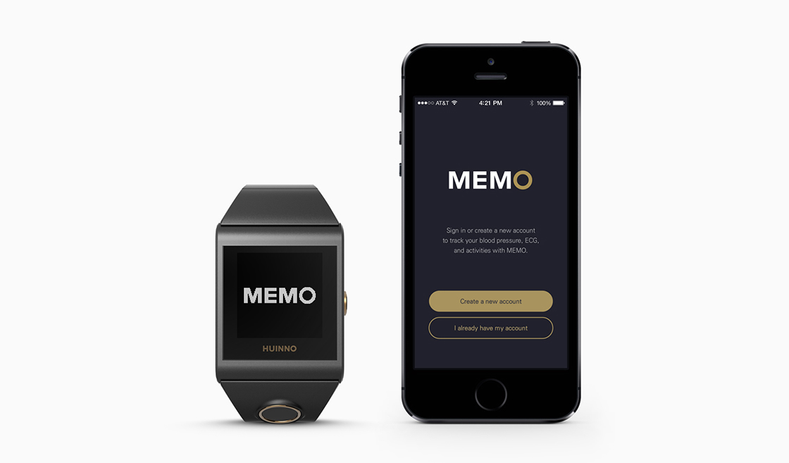
MEMO is a clinically-tested wearable blood pressure monitor. It was designed to track vital signs right from the user's wrist continuously and accurately.
The UX for both the device and its accompanying mobile application was designed while working alongside the product design team. The project scope also included brand identity and GUI design.
- Client HUINNO Co., Ltd.
- Year 2015
- Scope Device UX/GUI, BI, mobile application UX/GUI
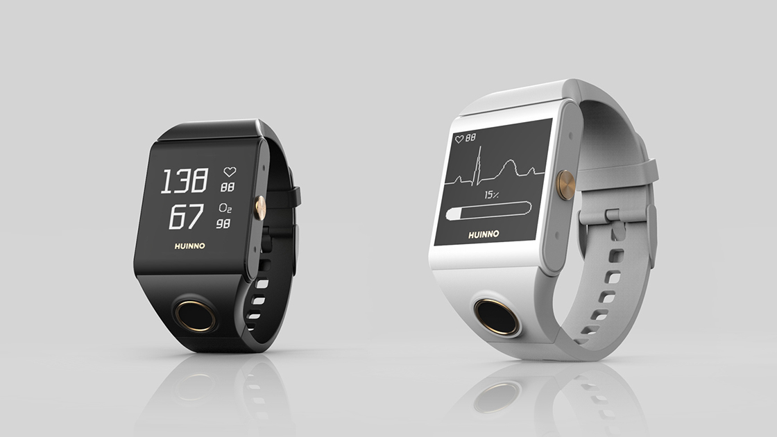
Device UX/GUI
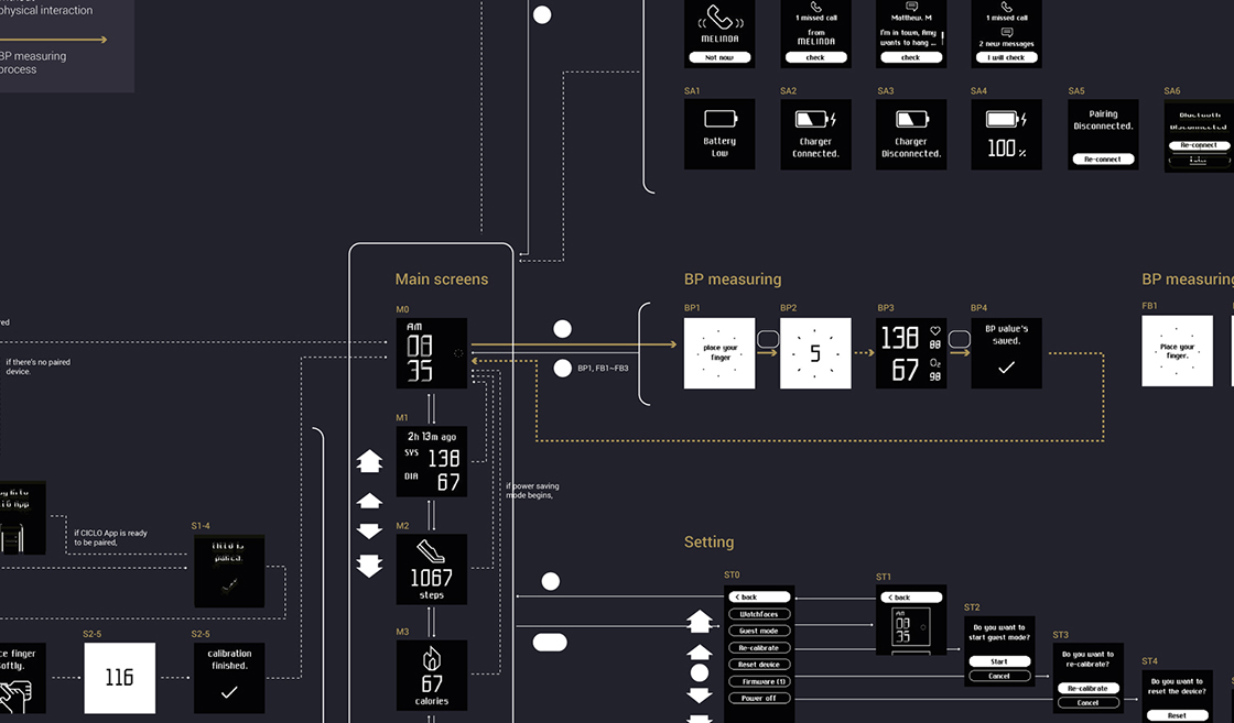
The key difference between the MEMO watch and other smartwatches in the market was that the MEMO watch could measure blood pressure from the wrist. Therefore, it required careful consideration in terms of ergonomics (e.g. placement and shape of its sensor and buttons) for easy usage and accurate measurement.
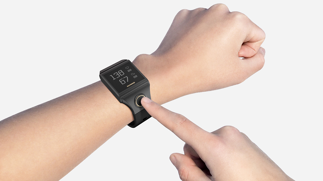
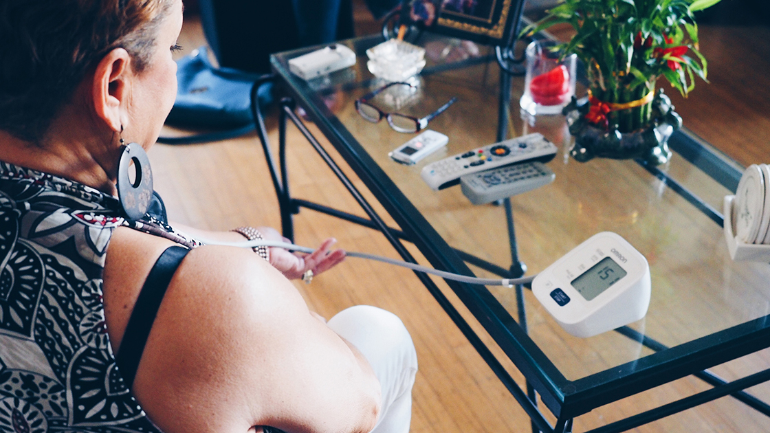
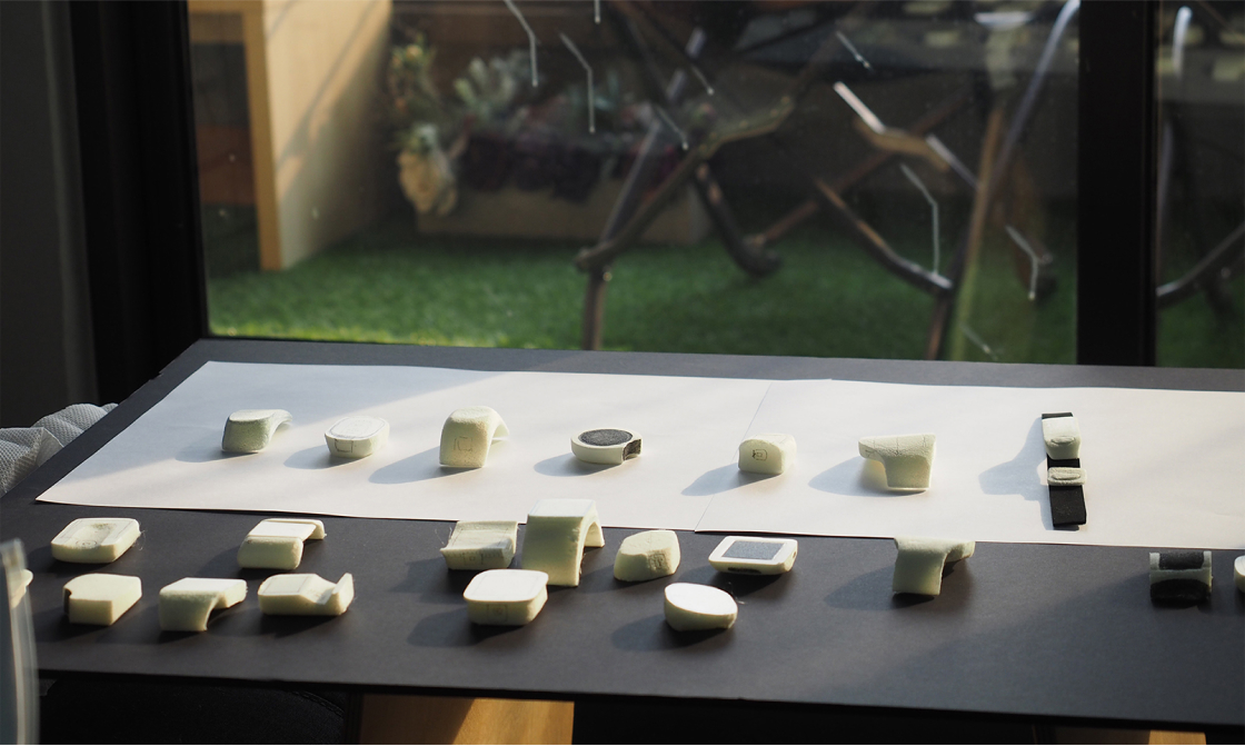
The following were the main points taken into account when designing the UX of the MEMO watch: effortless setup process, quick access to the blood pressure monitoring function, and intuitive feedback during the measuring.
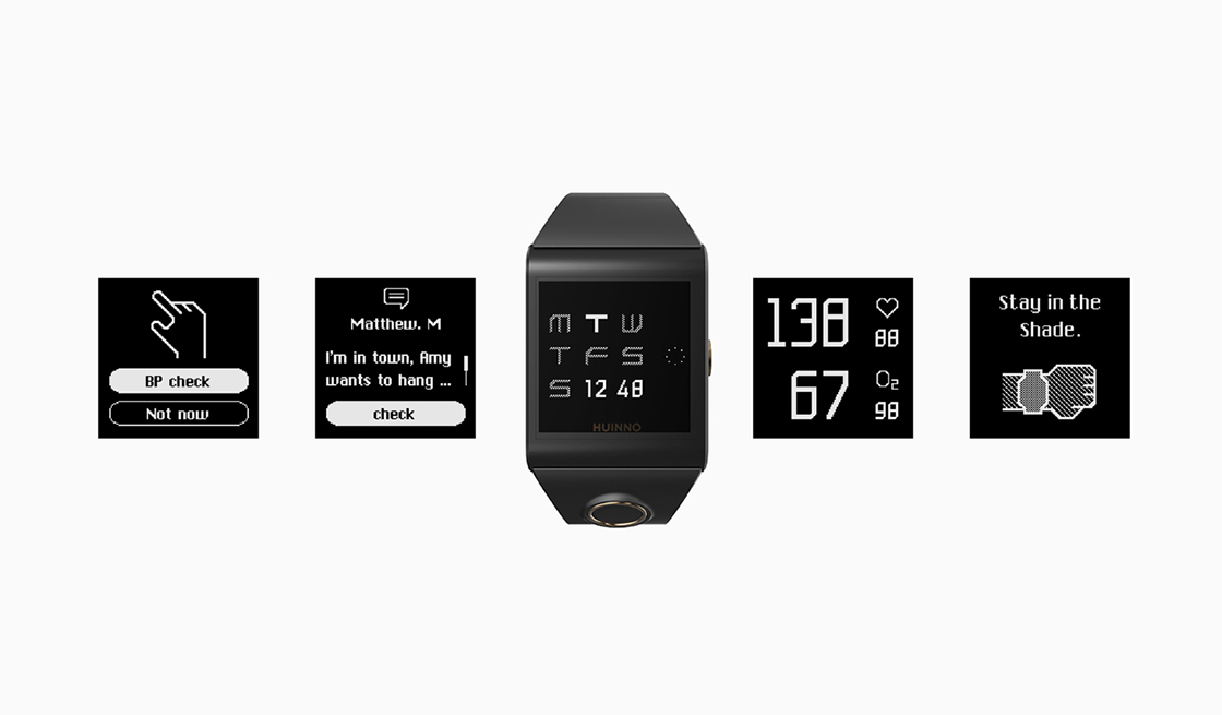
Making graphic components legible and visually appealing took a lot of work due to the device's small display with limited resolution and colours.
BI
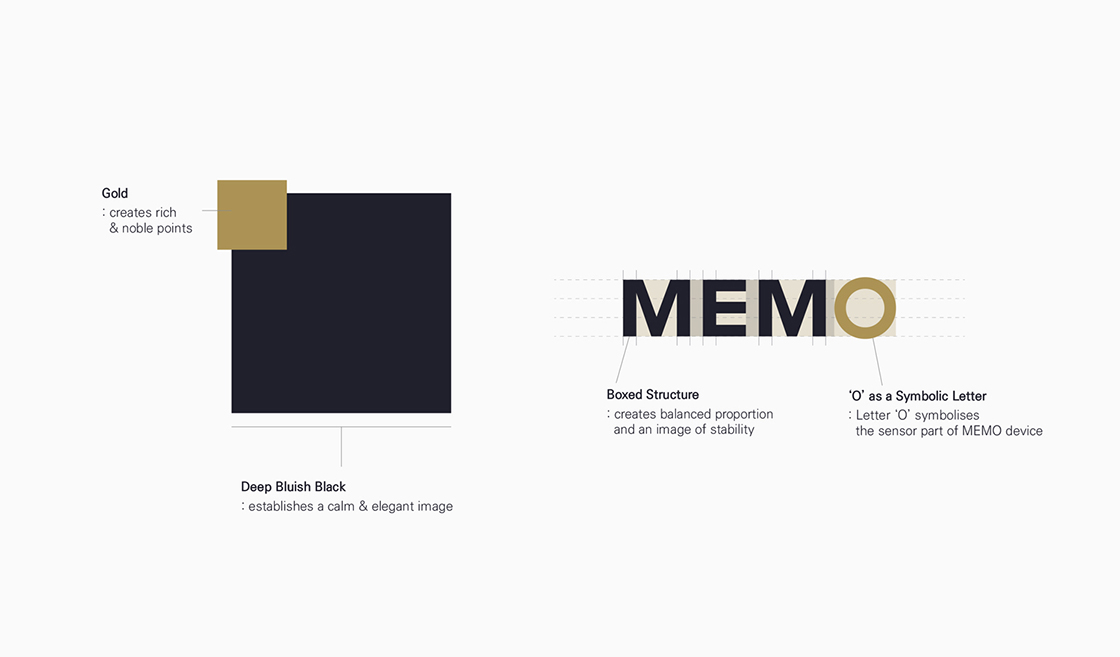
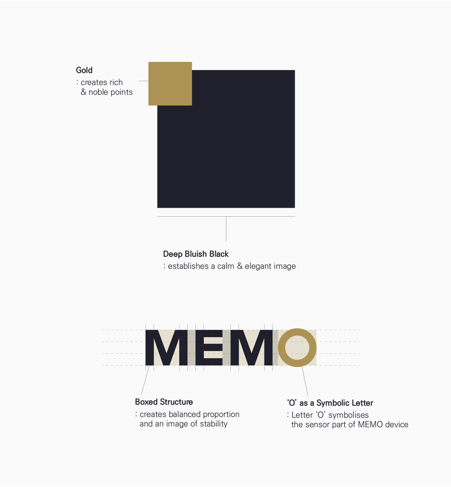
The MEMO logotype shares the same 'stable and bold' characteristics with the HUINNO logotype in respect of its overall structure and shape. In addition, the main colour palette consists of deep bluish-black and gold colours in order to build a prestigious image.

Mobile application UX/GUI
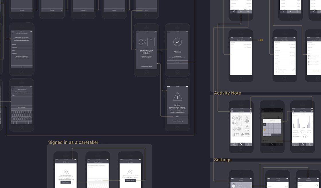
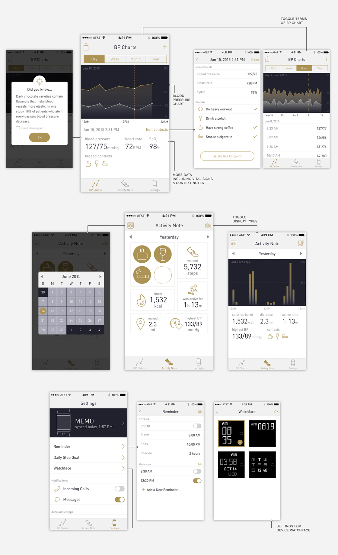
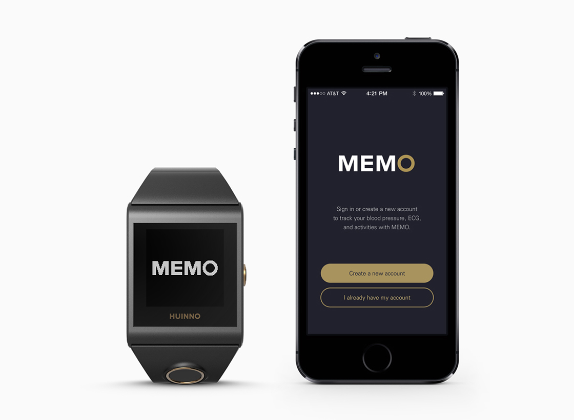
The primary role of the MEMO mobile application is to help users intuitively understand trends in their blood pressure so that they can manage their health on a day-to-day basis. Blood pressure data measured with the watch automatically syncs to the application, and users can also input data manually. Processes for signing up and pairing the device were designed to have as few steps as possible so the first impression of the application could stay positive.
