alookso UX Redesign
Since alook.so was launched, various features and pages have been added, changed, or deleted over a period of time. However, design debt has accumulated over time as these updates have not always been integrated organically with each other. Despite the consensus within the team regarding the need for improvement, it had not been prioritised due to resource issues until the design system project began, which opened up the opportunity for a UX revamp.
Having reevaluated the overall structure of the entire system and taking the user feedback with data collected into account, following points were prioritised for redesign. (Due to business circumstances, these were not implemented in the service.)
- Company alookso Corp.
- Year 2024
- Scope UX redesign
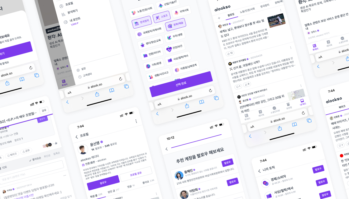
Reorganising of pages and features
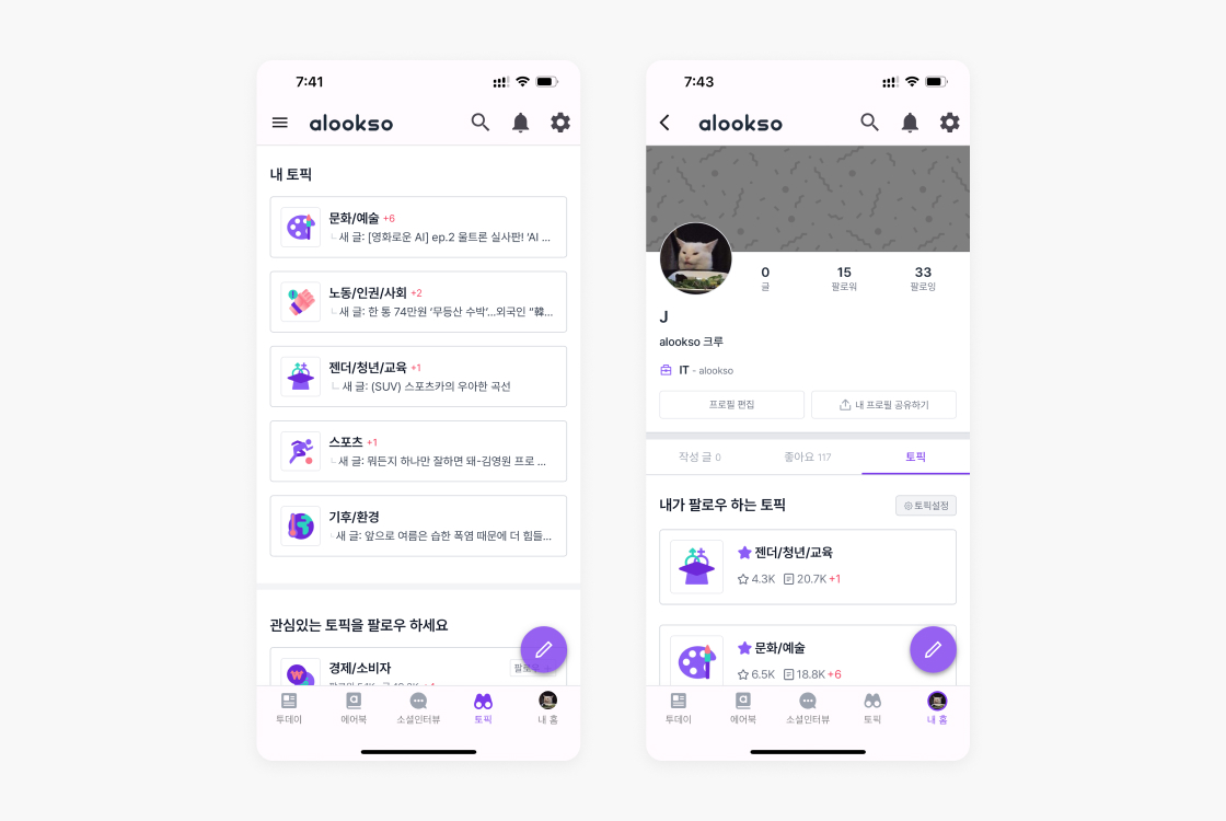
Some parts of the service are redundantly shown on multiple pages even though they are not of high importance, and some parts are split into different pages despite having similar properties. Both make it difficult for users to understand the logic of the menu and page structure, leading to poor usability.
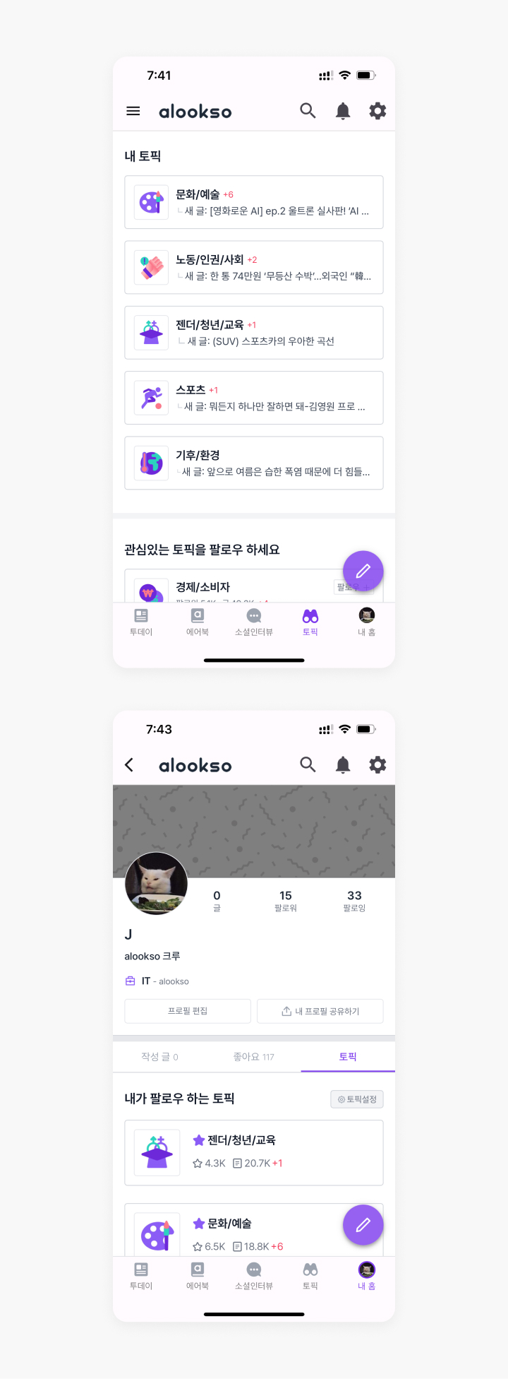
Features related to following the topics being overly prominent and redundant compared to their importance
![[My Home] and [My Profile] which users often find confusing [My Home] and [My Profile] which users often find confusing](/assets/images/works/alookso-ux-redesign/page-organising-as-is-02-mobile.jpg)
[My Home] and [My Profile] which users often find confusing
In order to tackle these issues, the entire page tree of the service was unfolded and detailed sections within each page were revisited and reorganised.
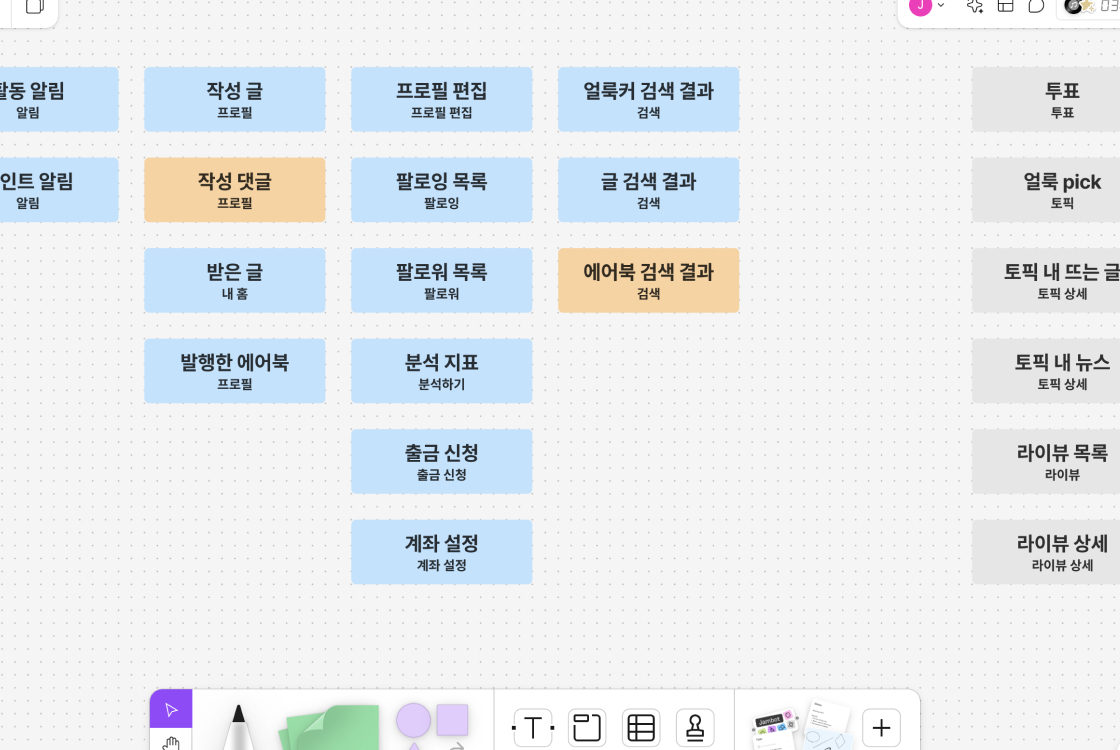
Firstly, [Topics] and [My Home], located in the bottom navigation bar, have been replaced with [Library] and [Feeds].
[Feeds] is a combination of [Topics] and the Feed tab in [My Home], allowing users to see the latest posts from people they follow or topics of interest in one place. The name [My Home] often led people to mistake it for [My Profile], so to avoid confusion, it was renamed to [Feeds].
[Library] is a separate, renamed version of [My Home] that contains only Bookmarks tab and Airbooks tab. While [Feeds] is designed to be constantly updated with new content, [Library] is a collection of content that users have marked for later revisiting, such as bookmarked articles or saved Airbooks (eBooks).
![Alternative navigation menu suggestions: [Library] and [Feeds] Alternative navigation menu suggestions: [Library] and [Feeds]](/assets/images/works/alookso-ux-redesign/page-organising-to-be-01-mobile.jpg)
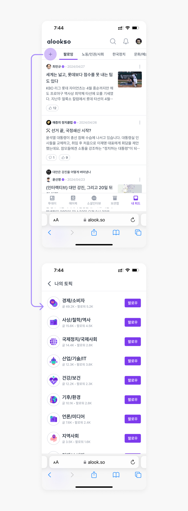
Top: [Library], a collection of content that users have marked for later revisiting / Bottom: [Feeds], designed to be constantly updated with new content
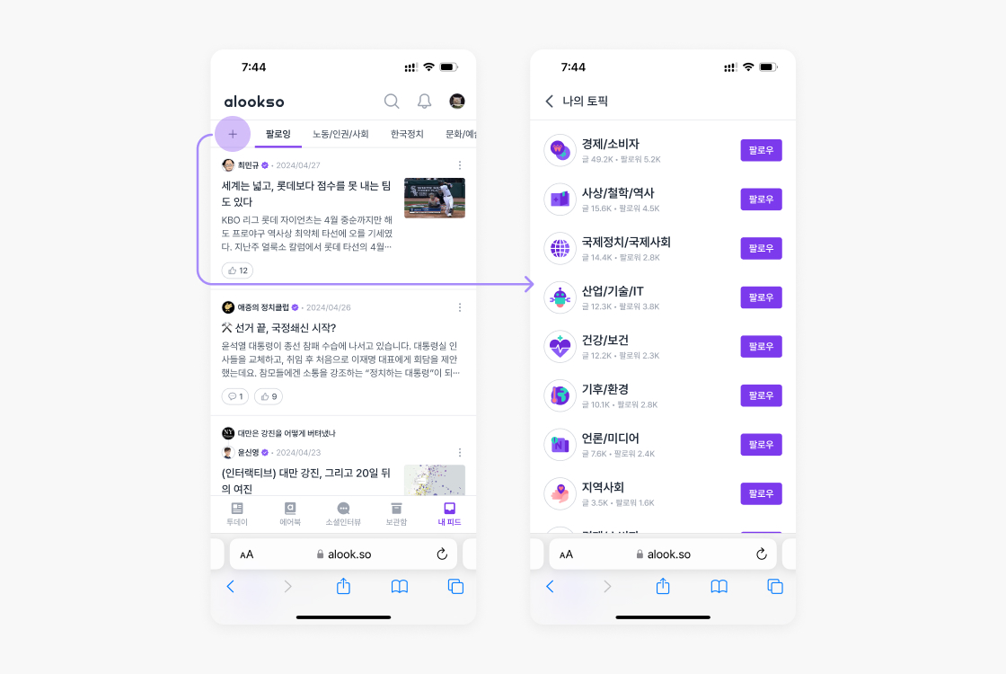
Since the follow/unfollow topics feature is overly prominent in current [Topics], it has been changed to be accessed by clicking the leftmost + tab button in [Feeds].
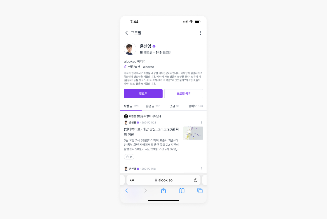
In User Profile, unnecessary or redundant parts such as header images and Topics tab have been removed, and the information has been reorganised to highlight the bio, activity history (posts, comments), and interactions with other users (received posts, likes).
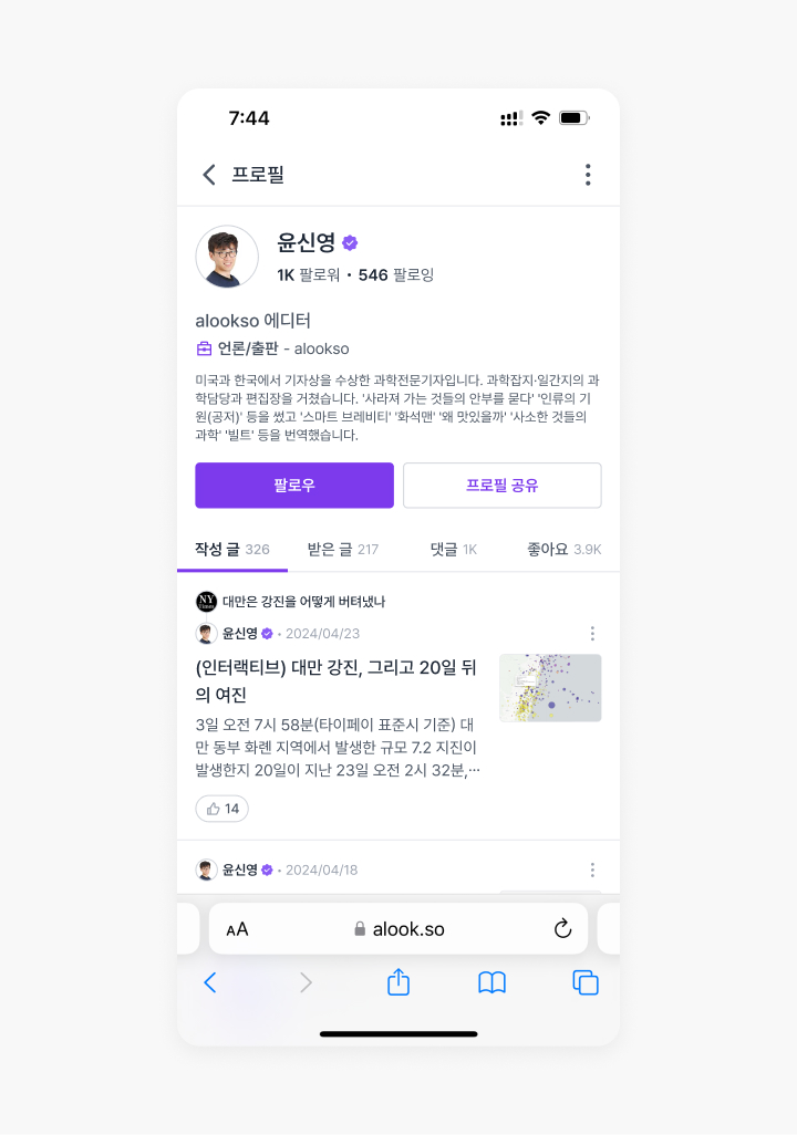
Changes on the sign-up UX
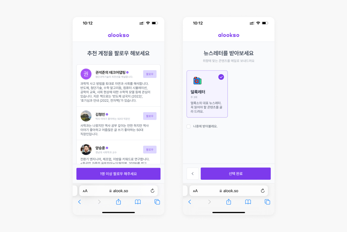
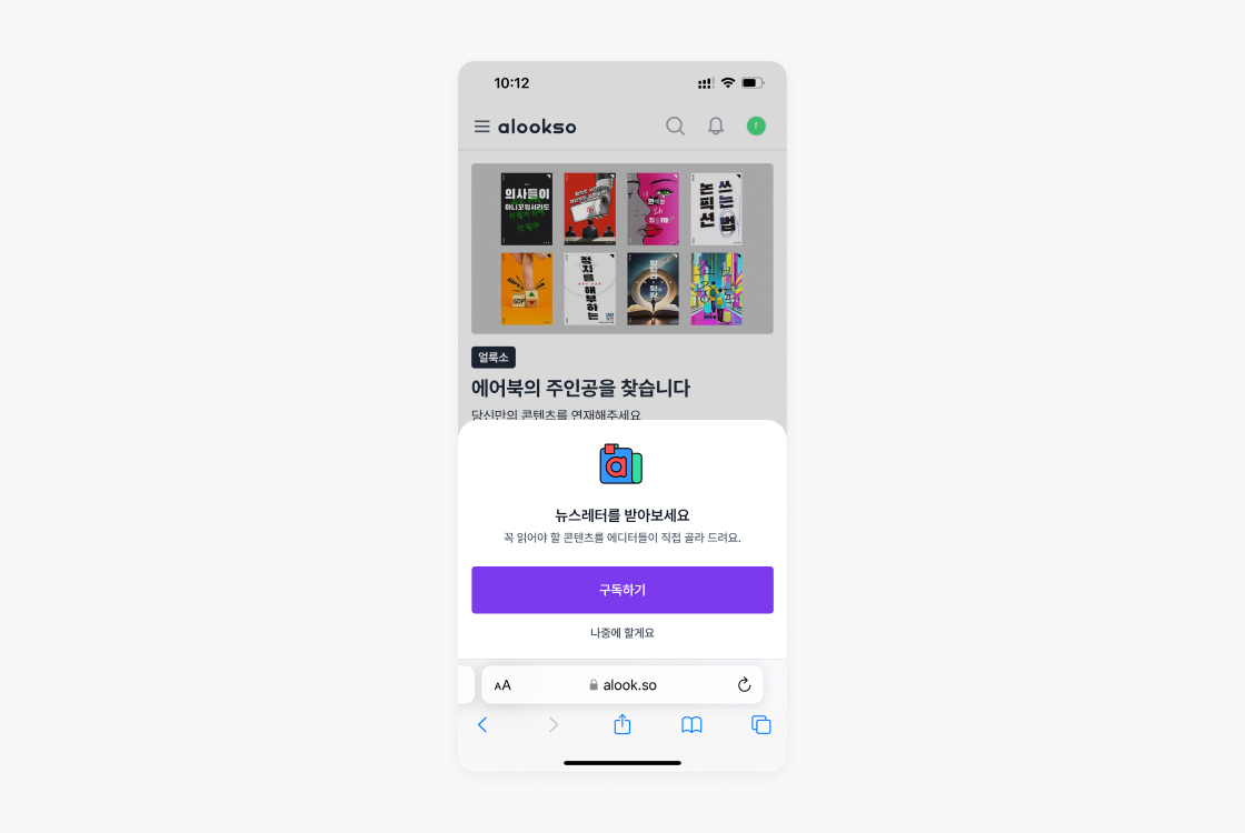
After creating an account, users are asked to select who to follow and which newsletters to subscribe to, which is a) inefficient because it recommends a fixed list of people to follow instead of tailoring it to each user’s interests, and b) unnecessarily bulky as there’s only one newsletter that alookso publish has left.
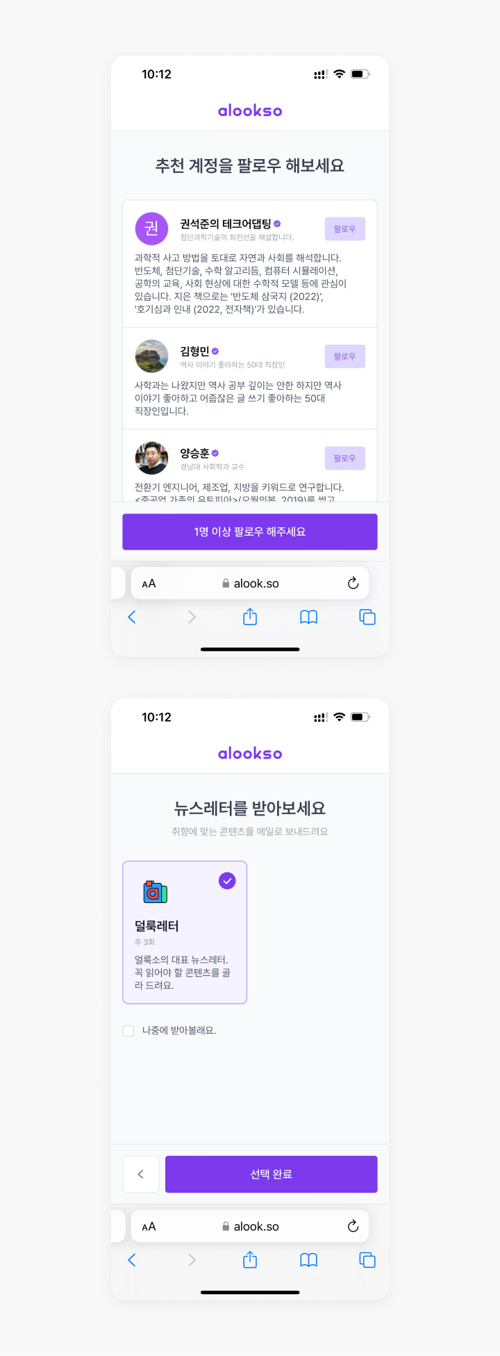
Top: unpersonalised and therefore inefficient follow recommendations list / Bottom: unnecessarily bulky step for a newsletter opt-in
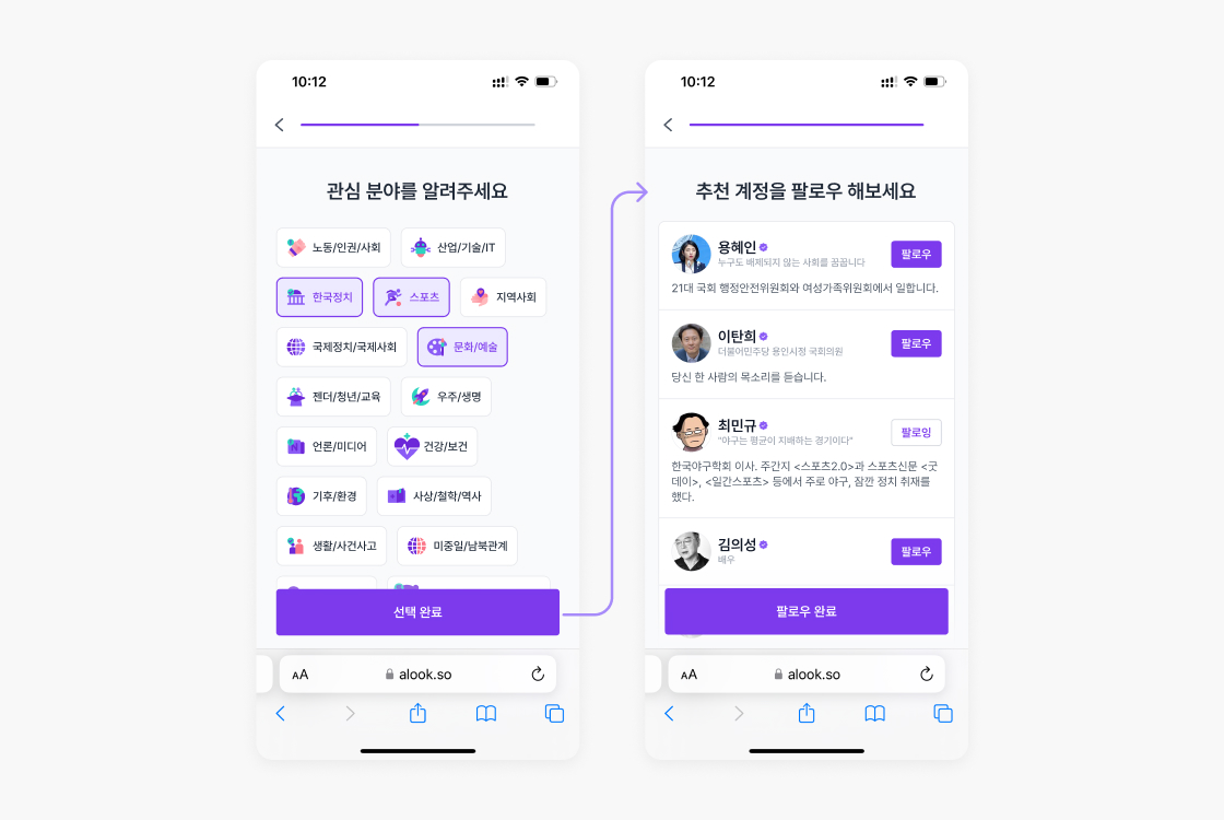
The proposed change asks users to select their topics of interest first, and then shows a follow recommendations list in a subsequent step.
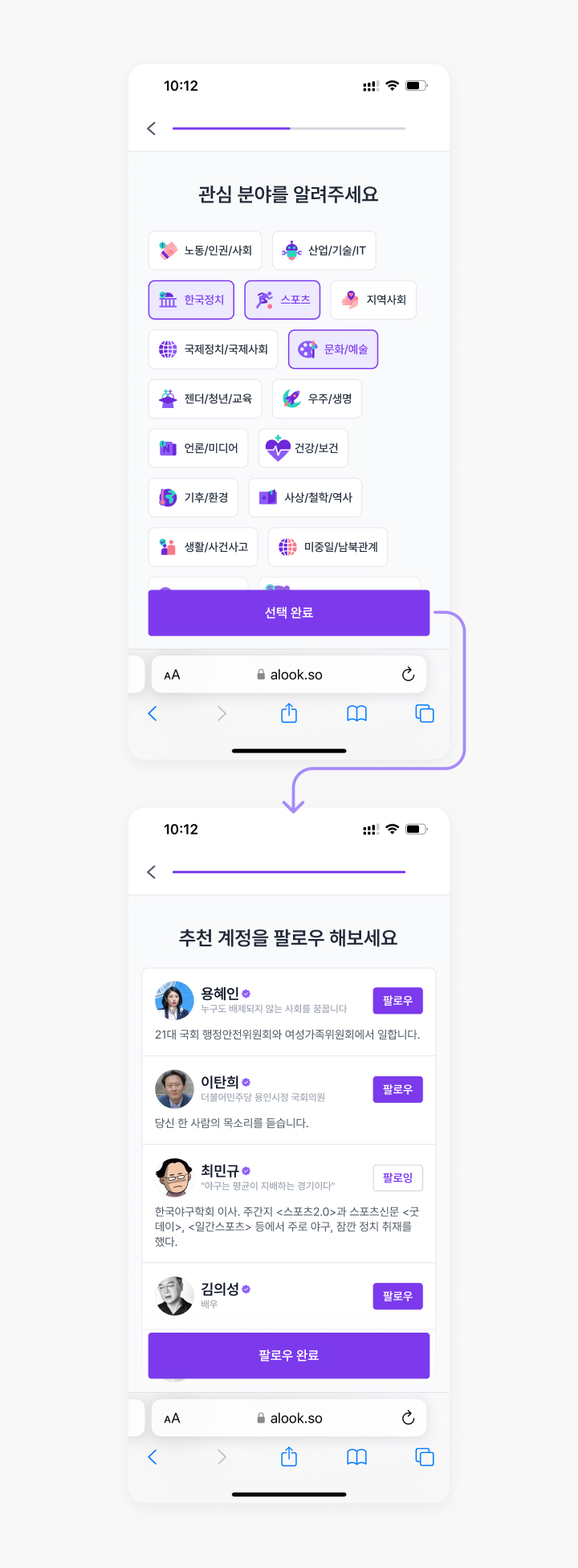
Also, instead of keeping the newsletter subscription option on a separate page, it’s lightened up by utilising the bottom sheet UI.
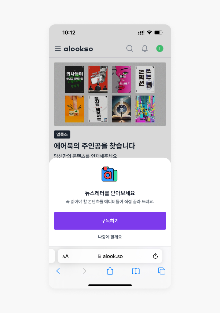
Changes on the mobile menu UI
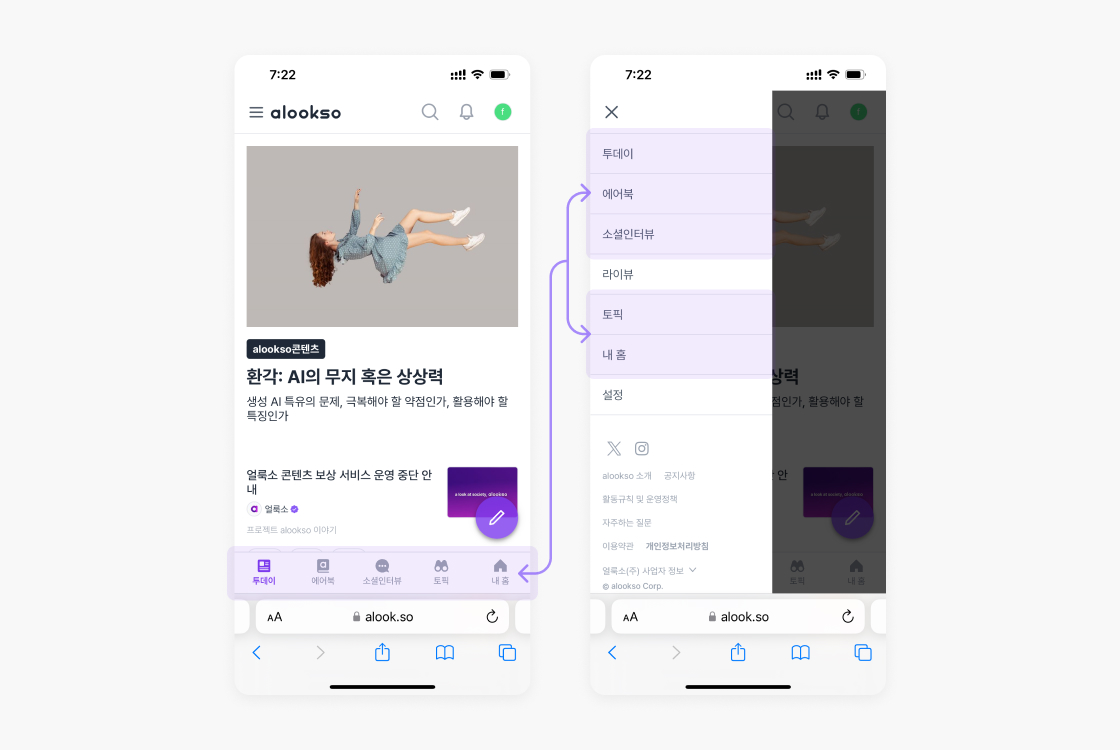
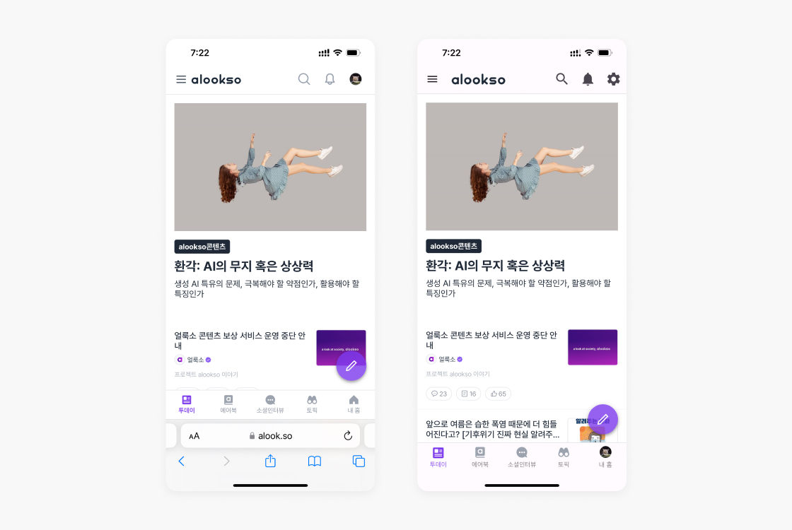
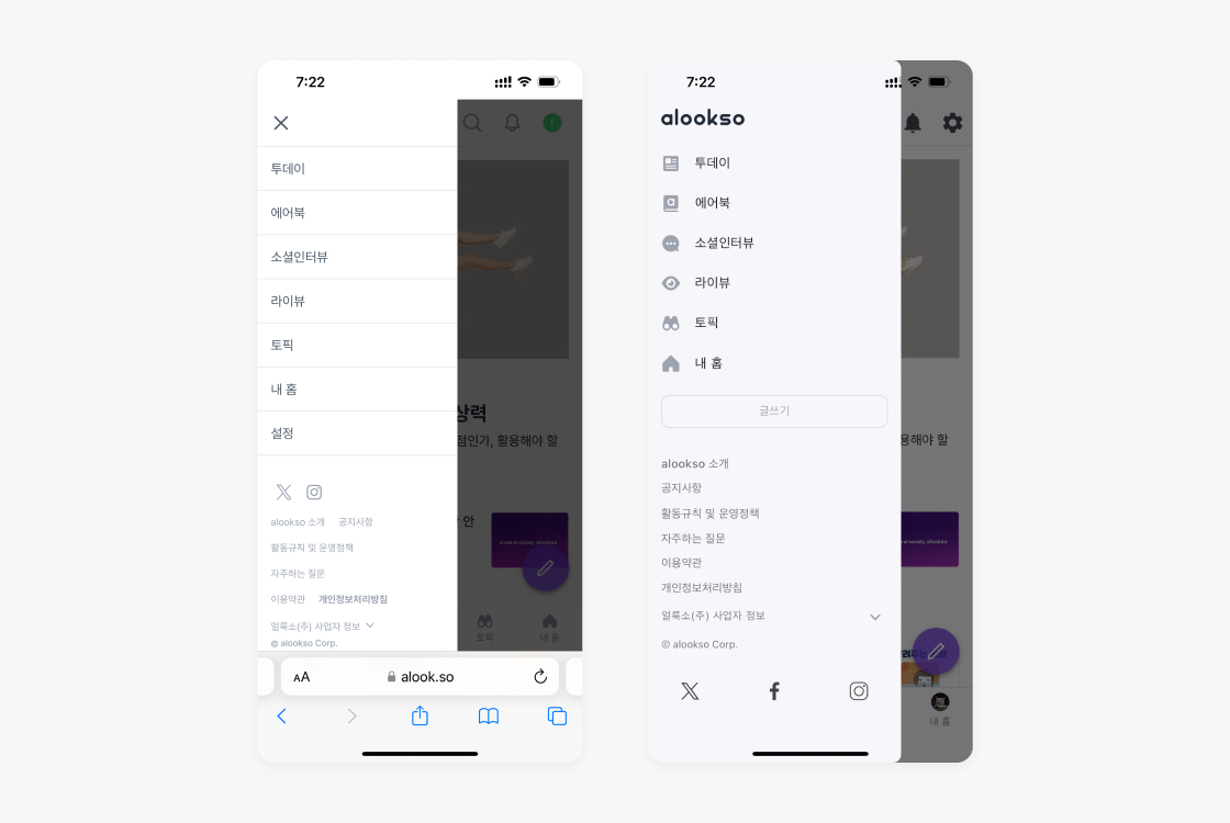
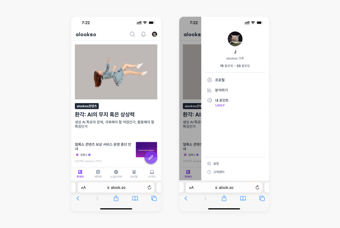
To address a) the inefficiencies of the bottom navigation and the left drawer menu being redundant on mobile, and b) the inconsistency of menu design across mobile web and app, the following suggestions were made regarding the mobile menu UI.
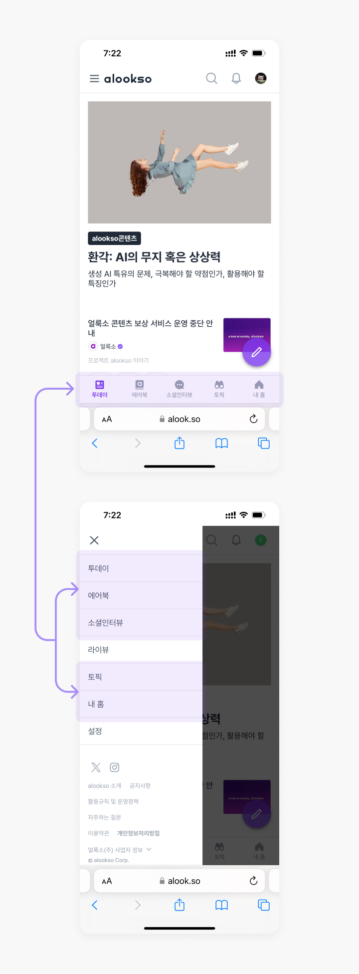
Redundancies in the bottom navigation and the left drawer menu
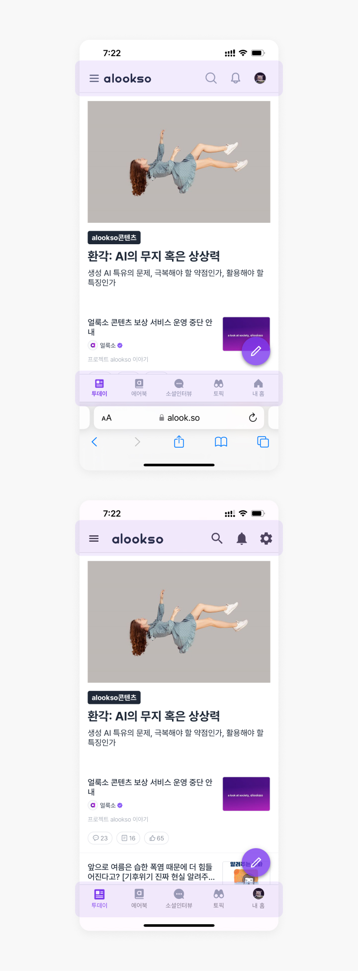
Inconsistency in the top and bottom navigation bar design across web and the app
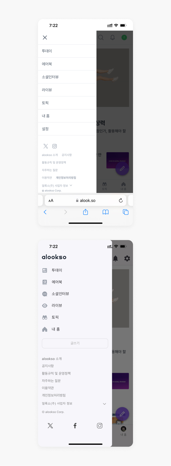
Inconsistency in the left drawer menu design across web and the app
In the proposed design, both mobile web and app c) have the top-left menu button removed, and d) utilise the top-right button (which links to [My Profile] on web and [Settings] on app) as a drawer menu button to include both pages’ features and also some features that were previously in the left drawer menu. This will eliminate duplicates and bring less accessible menus (e.g. My Profile, Analytics, My Points) to the front.
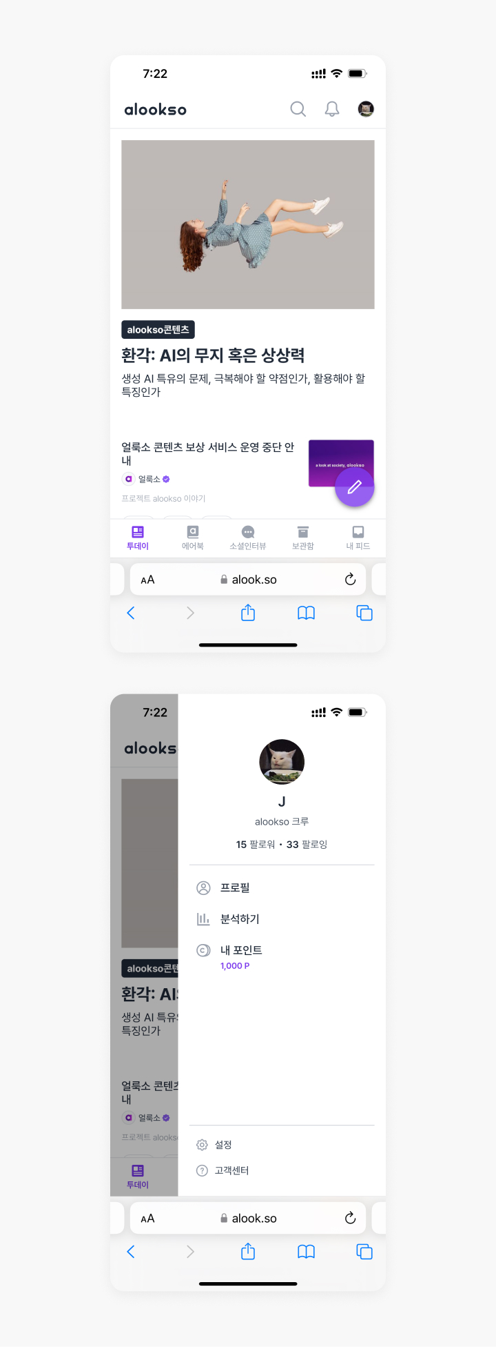
UI suggestion for the mobile menu
Changes on the post comment UI
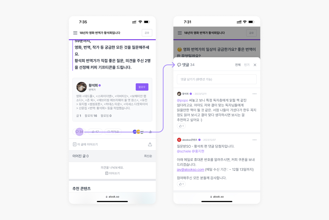
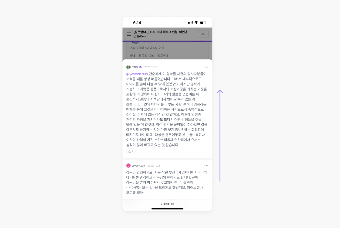
To view comments on a post, users have to click a button to open a modal. Also, within the modal, comments are only sorted by newest, and there is no hierarchy between comments, resulting in difficulties in understanding context and relevance between comments.
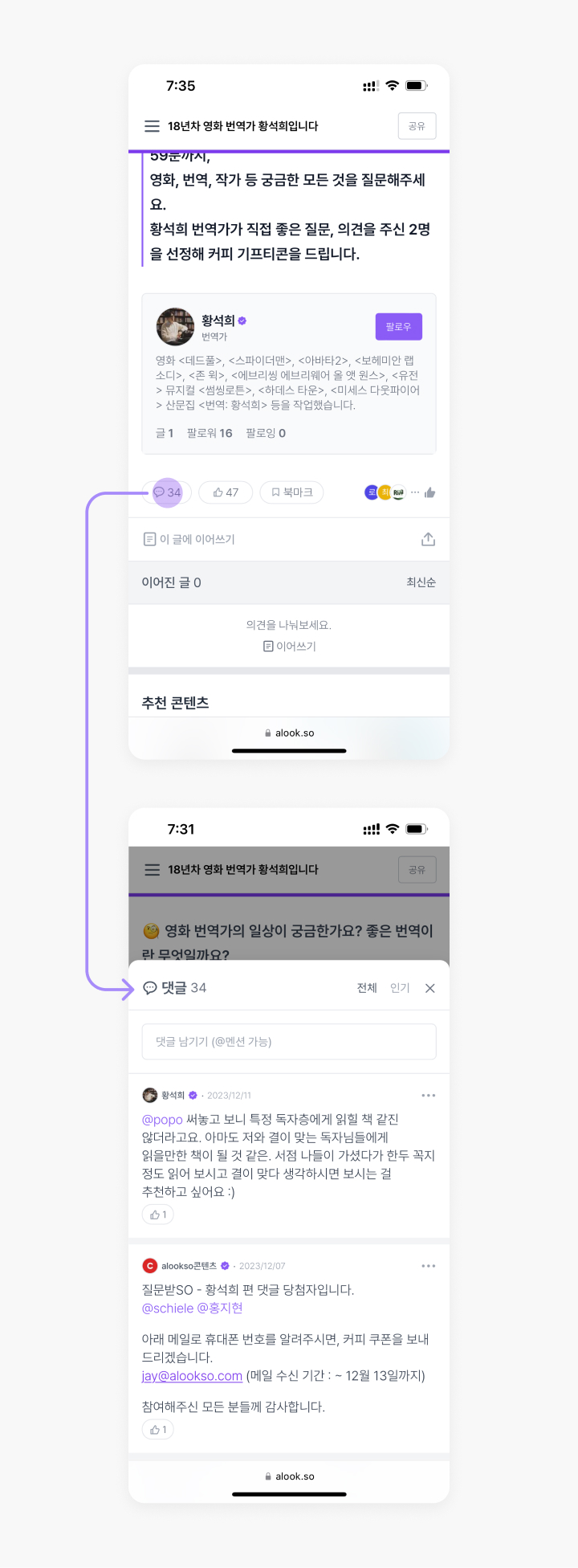
Comments only showing up when a user clicks the button at the bottom of the post
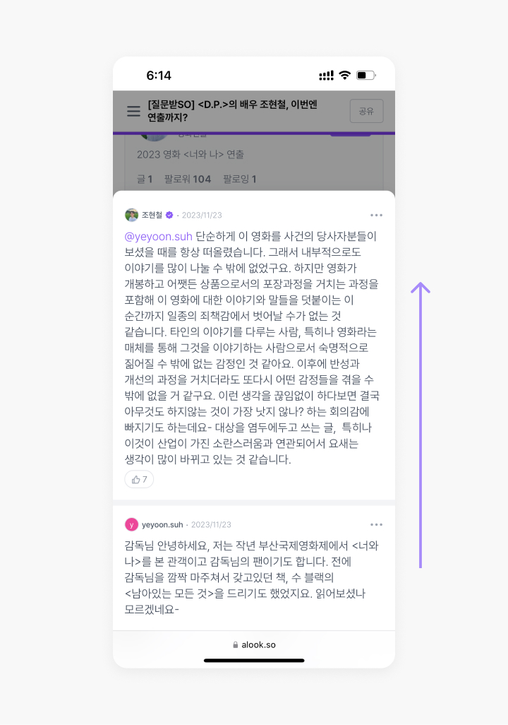
Comments sorted only by newest and having no structural hierarchy, requiring reading in reverse order to gain context
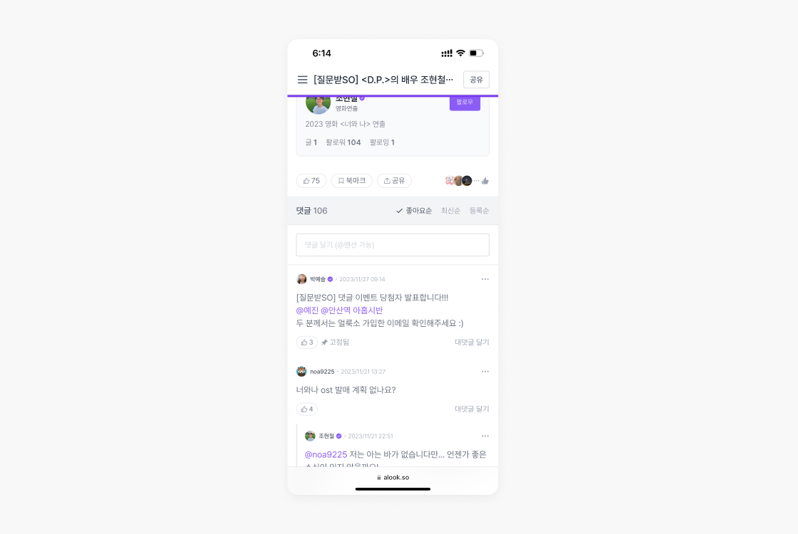
To improve user engagement with comments, the following suggestions were made to address each issue: a) remove the unnecessary button-click step and put the comment list directly at the bottom of the post body to increase visibility, b) add a threaded comment structure to improve readability, and c) provide options to sort comments by most liked and oldest in addition to newest to make it easier for users to explore them.
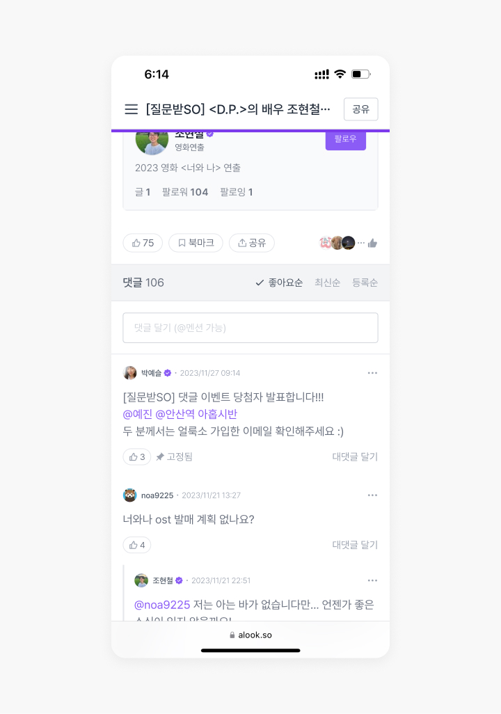
UI suggestion for the post comment section
![[My Home] and [My Profile] which users often find confusing [My Home] and [My Profile] which users often find confusing](/assets/images/works/alookso-ux-redesign/page-organising-as-is-02-desktop.jpg)
![Alternative navigation menu suggestions: [Library] and [Feeds] Alternative navigation menu suggestions: [Library] and [Feeds]](/assets/images/works/alookso-ux-redesign/page-organising-to-be-01-desktop.jpg)
