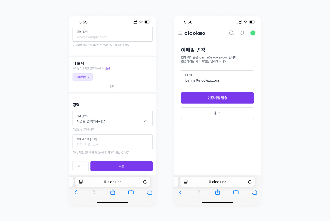
alookso Design System
A design system is essential for delivering a consistent product experience and efficient communication within the team. As both the alookso service and the development team had grown in size, the need for a design system became even greater.
The foundations of the alookso design system were established by reorganising existing design elements into the new structure while tidying up fragmented or redundant components simultaneously.
- Company alookso Corp.
- Year 2024
- Scope Design system
Please note: some of the images in this page are not optimised for small screens. It is encouraged to read this page on tablet or devices with bigger screens.
Project background
The team had a change of designers and developers, but due to the inadequate handover process for existing work, we were experiencing difficulties in keeping a track of the product's history internally. In addition, the more we added new features or made maintenance to the product, the more fragmented the code and design became. This led everyone on the team to agree on the need for a thorough product review and creation of a design system.
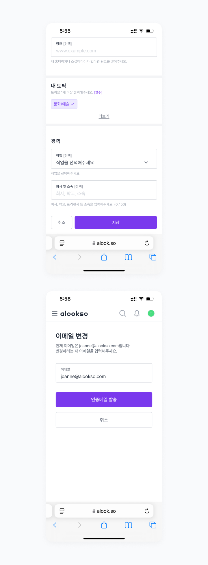
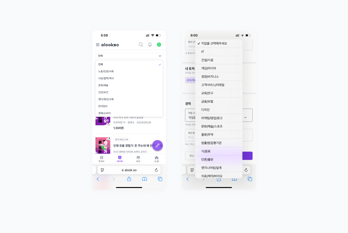
Inconsistent button size and arrangement
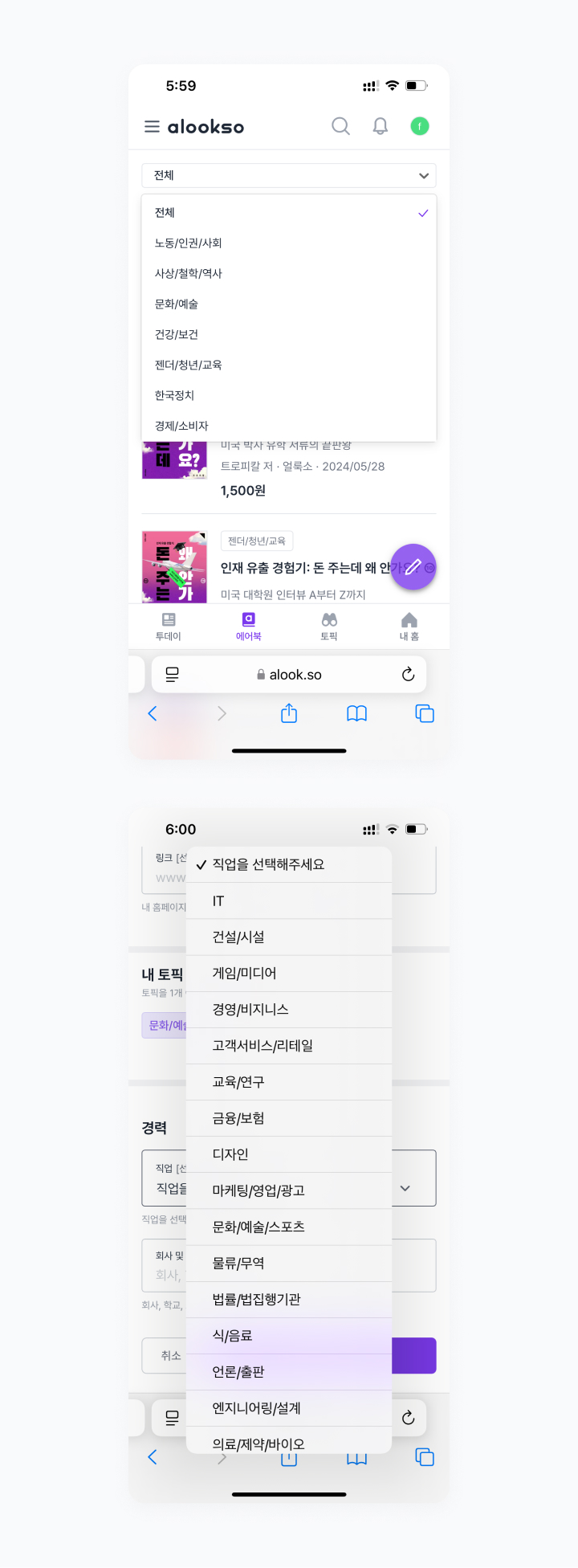
Same controls having different UI
In this context, we decided to migrate the product from Ruby to Next.js and rebuild all of the pages, which gave us the opportunity to start cleaning up the fragments, at least partially. Additionally, the team grew in size with the addition of a new designer and product managers, putting a higher priority on setting up a design system.
Considerations before proceeding
Because the resources we could allocate to the project were limited given our other workloads, the team decided to focus more on laying the fundamentals rather than striving for perfection from the start, and aimed for version 0.x not version 1.0.
Given that the original UI was developed using Tailwind CSS, the approach in detailing the design system was to share the basics but make adjustments where necessary.
Furthermore, to achieve better efficiency and readability, the system was stripped of unnecessary elements - for example, any colours, typography, etc. that were defined in the existing style guide but not used were removed during the de-cluttering process.
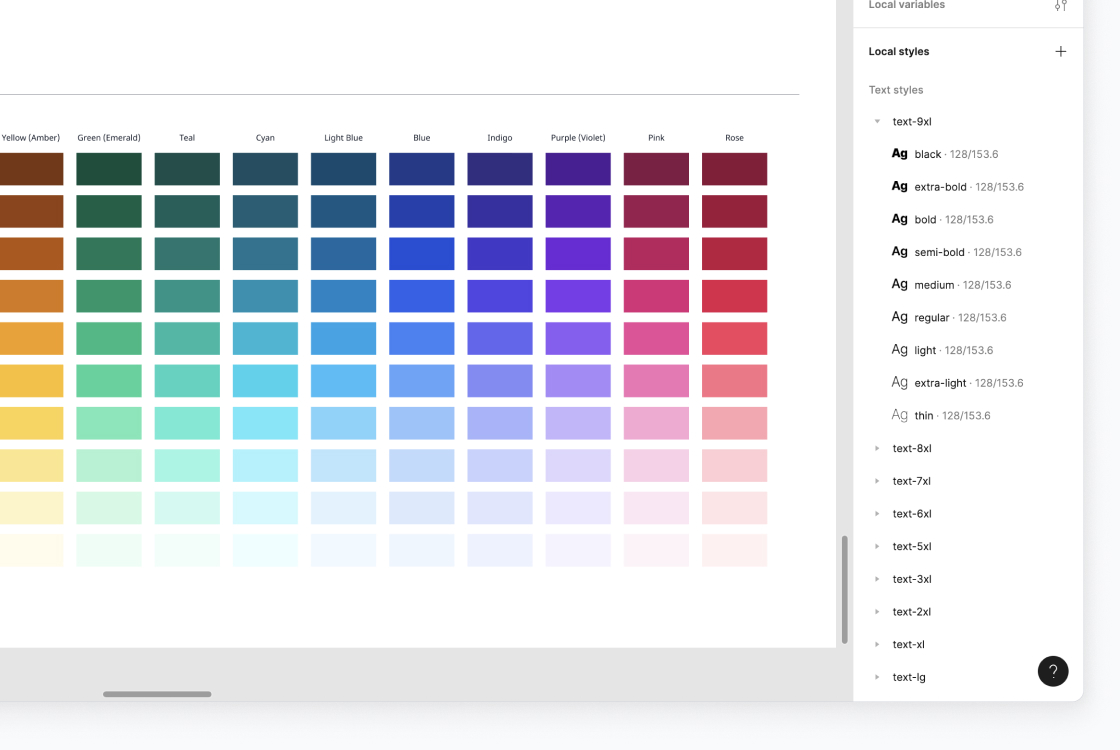
Excessively defined colours and typography styles
Structuring the system
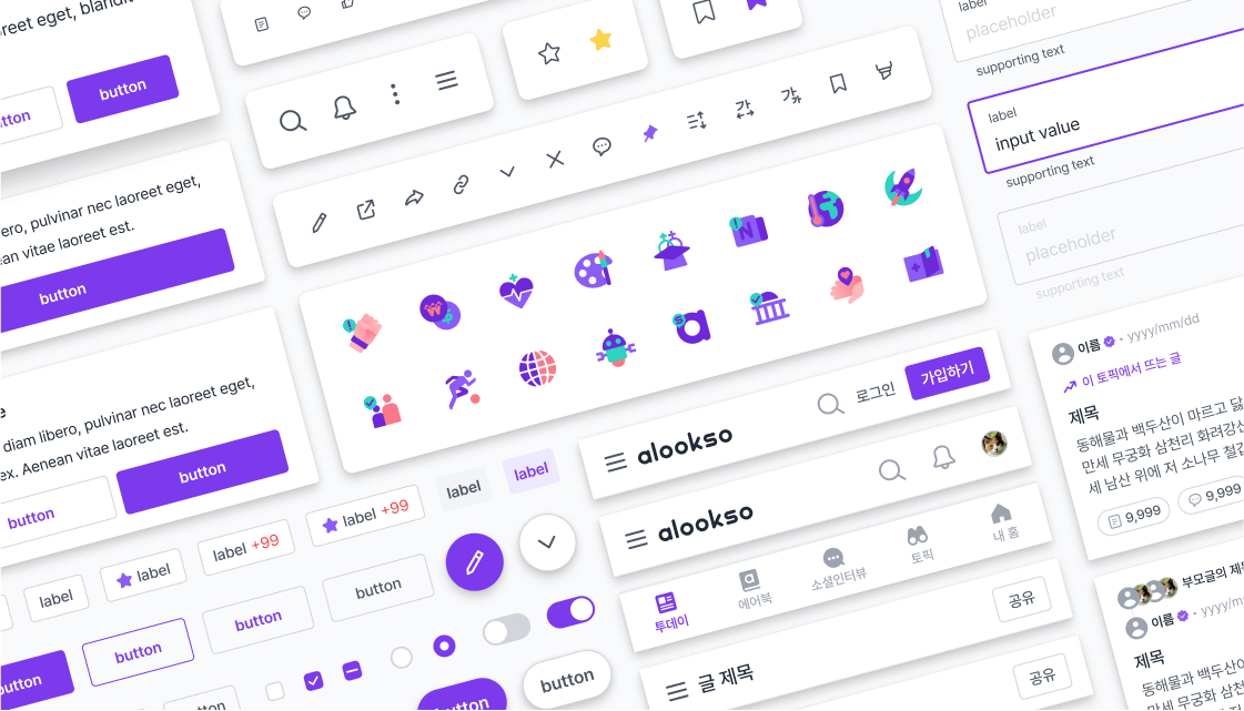
The alookso design system is structured in three levels: Foundation - Components - Patterns.
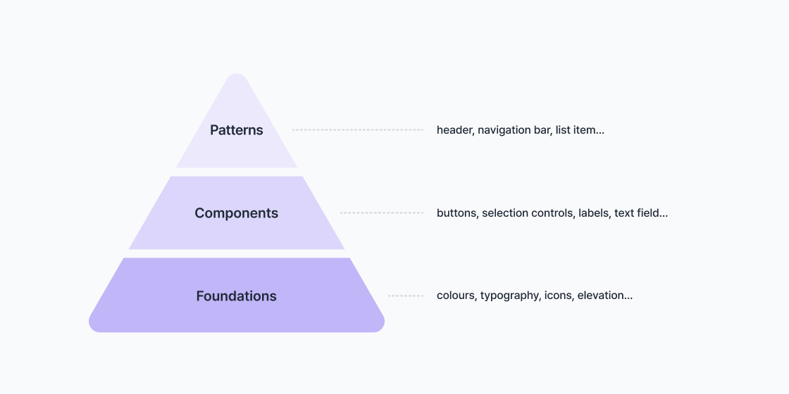
Foundations are the baseline elements that compose the system, such as colours, typography, icons, elevation, spacing, and opacity.
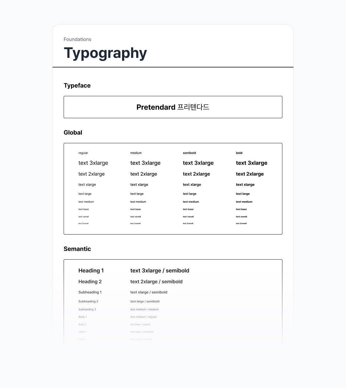
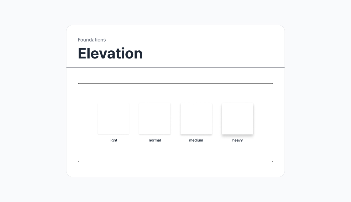
Components are built on top of the foundation elements. These are reused in design and include buttons, text fields, selection controls, tabs, and more.
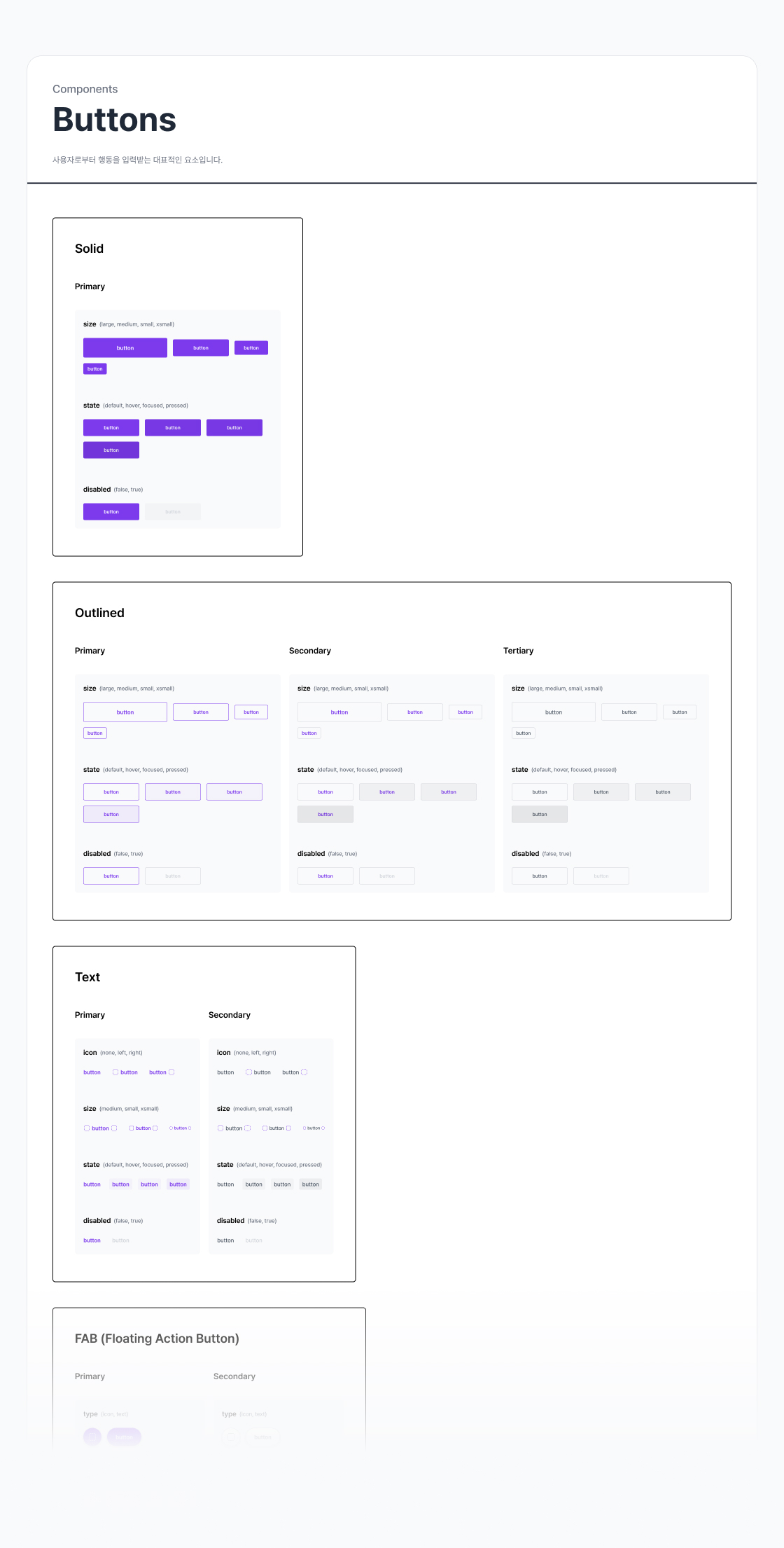
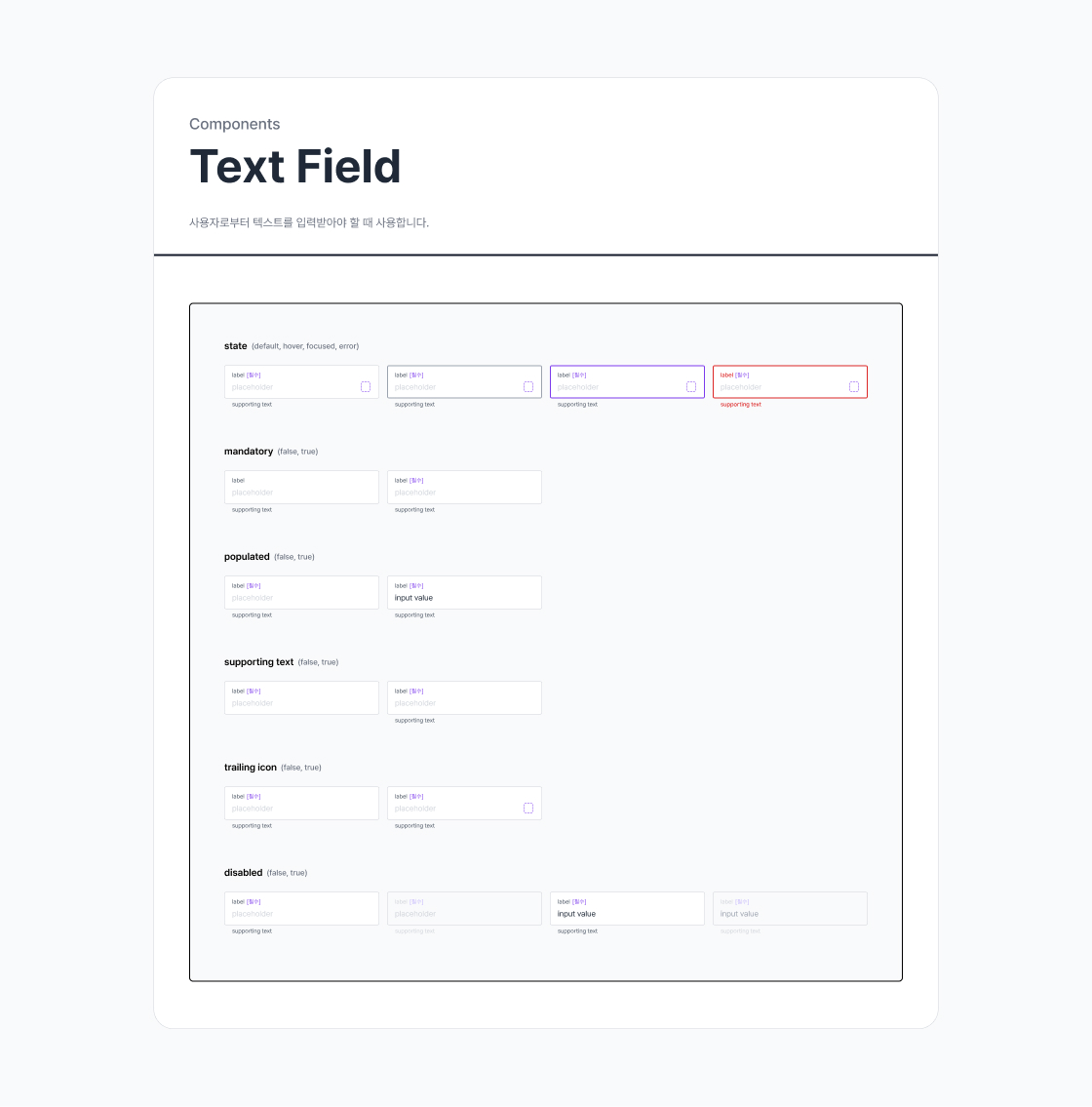
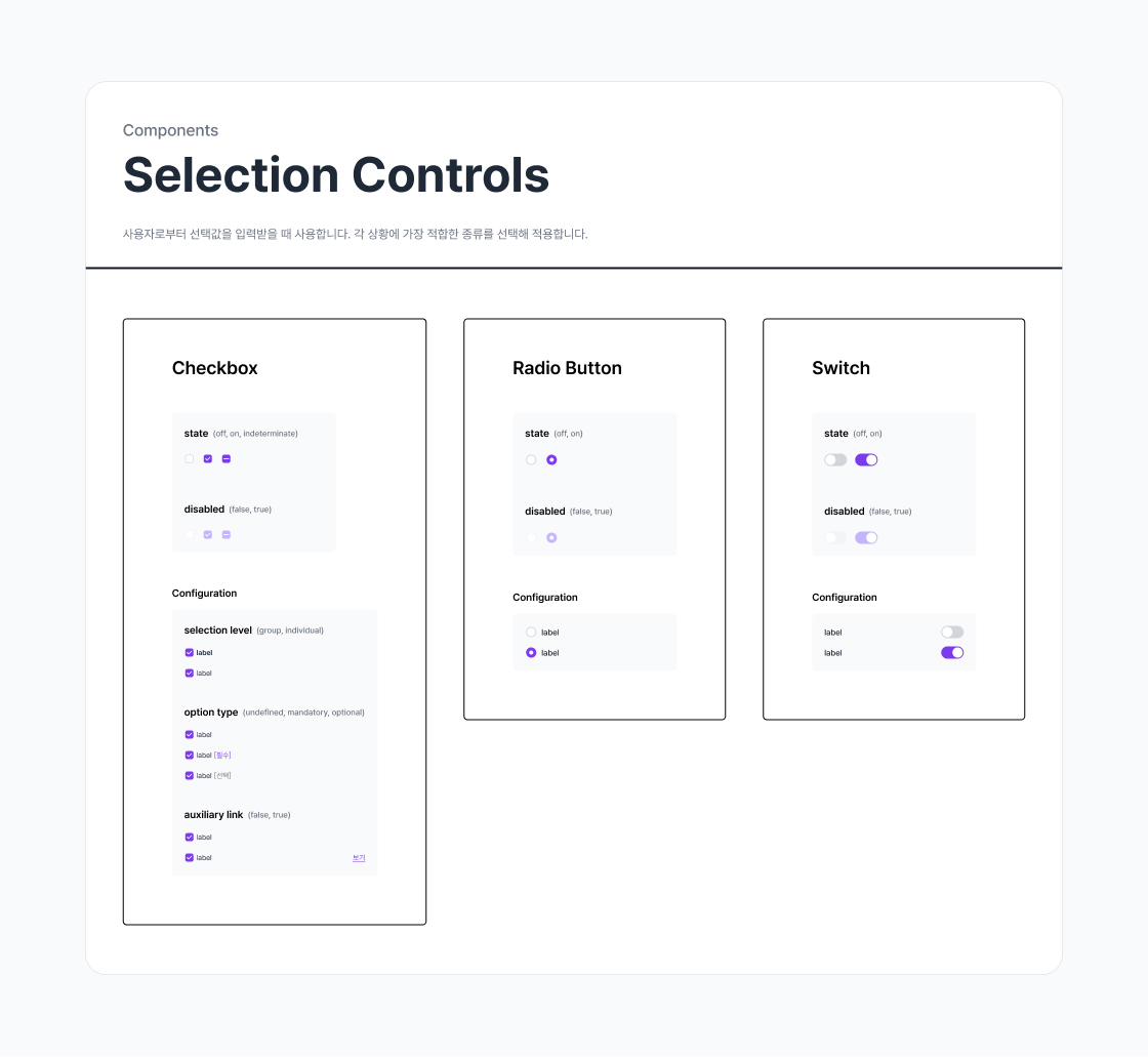
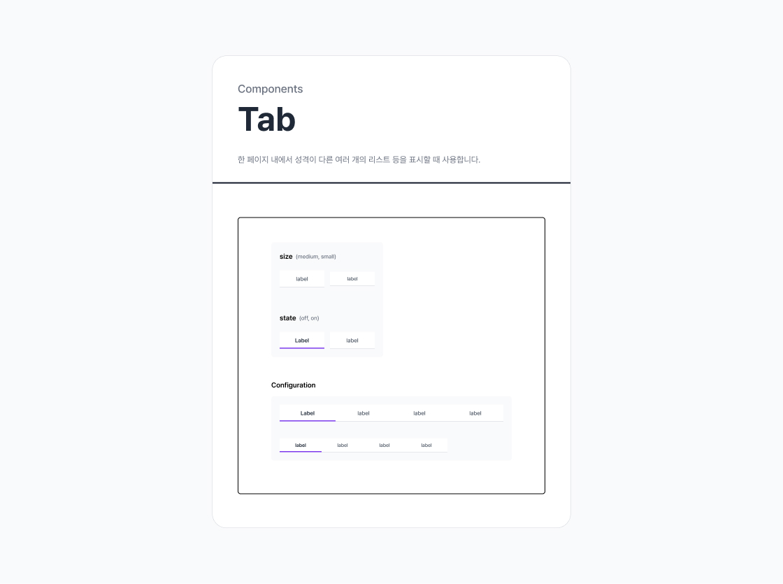
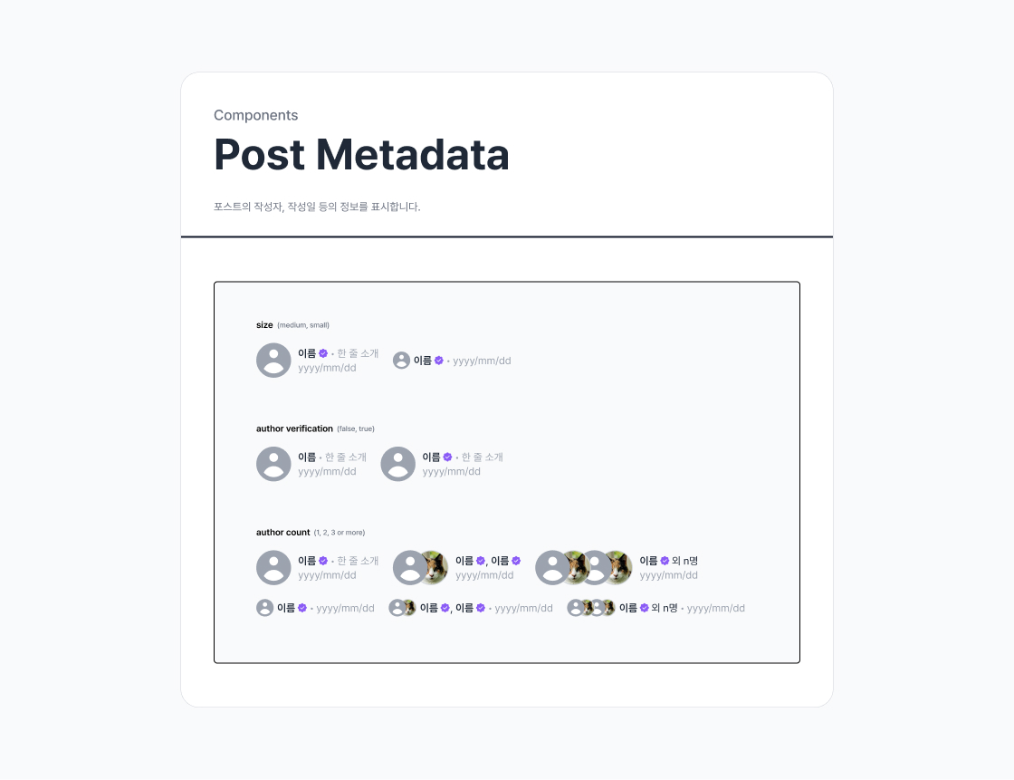
Patterns are combinations of components, and you can define repetitive configurations within your product as patterns to utilise. This can include header and navigation bar. In the alookso service, the post list item is a good example of a pattern item.
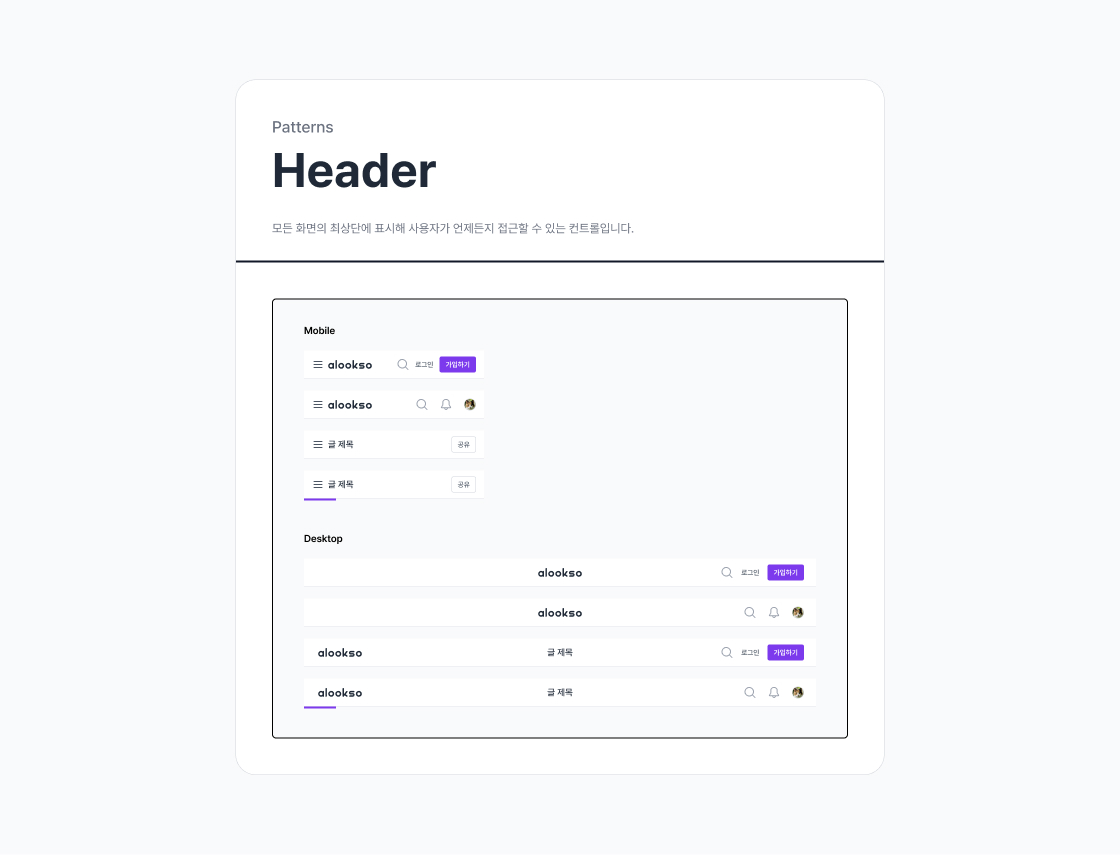
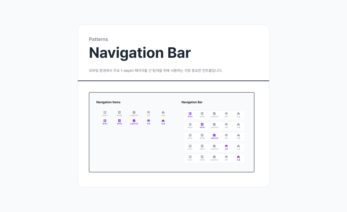
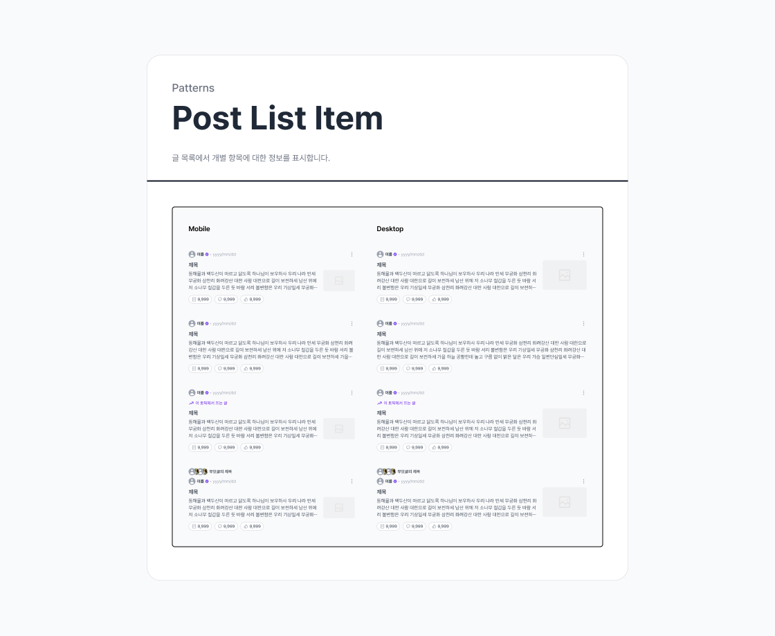
Defining tokens
The existing style guide had a range of colour and typography styles defined, but these were all generically named, making it difficult to identify which style should be used in which context. It also contained tones, scales, etc. that were not used within the product, causing inefficiencies.
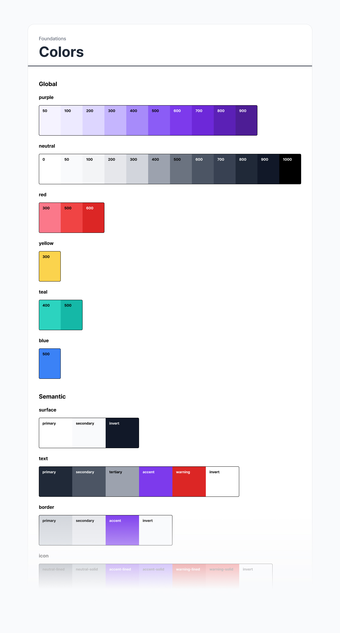
To improve efficiency and readability, redundant styles were removed from the library and design tokens were defined in two tiers: global tokens and semantic tokens.
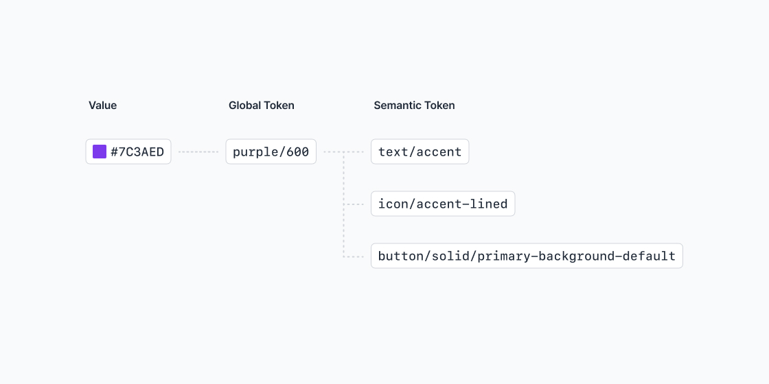
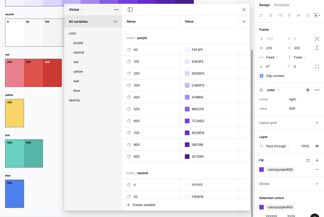
Global tokens provide an expansive view of what ingredients (i.e. styles) exist within the system. In order to minimise rework, the approach to defining global tokens involved reusing naming conventions from the existing style guide where possible.
Semantic tokens are about informing which ingredient should be used where, and therefore the naming and hierarchy were intended to be self-explanatory.
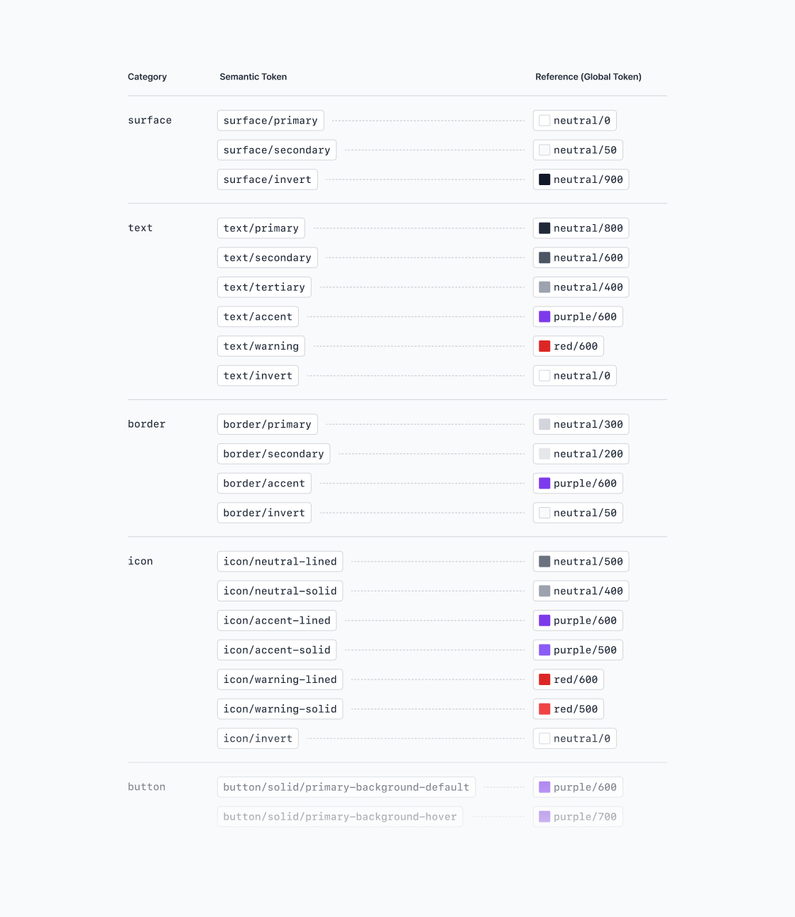
Semantic tokens for the colours
